> For the complete documentation index, see [llms.txt](https://docs.yecho.app/llms.txt). Markdown versions of documentation pages are available by appending `.md` to page URLs; this page is available as [Markdown](https://docs.yecho.app/user-guide/understanding-your-dashboard/apy.md).
# APY
***
The **APY** page gives you a complete overview of your portfolio's performance over time.
It allows you to:
* Track your **overall portfolio APY** over time.
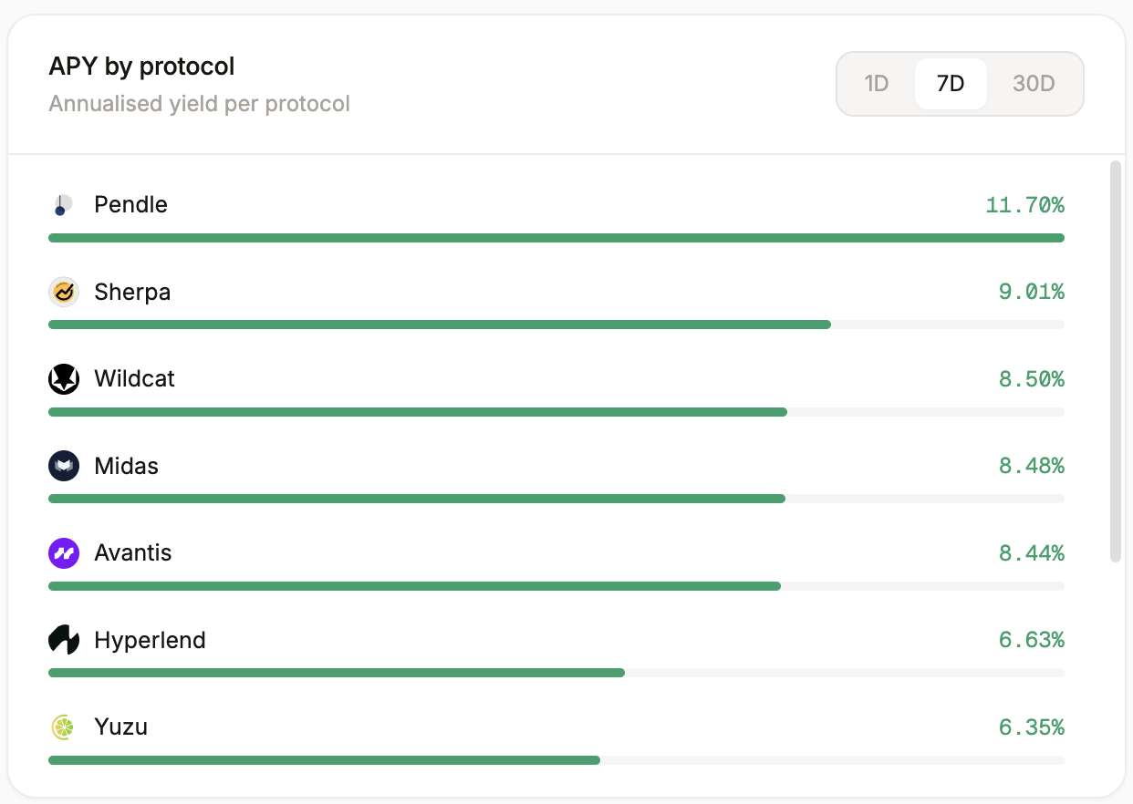
* Analyze your **APY by protocol**.
* Compare the **APY of each individual position**.
At the top of the page, you'll find a summary of your key APY metrics:
* **24h APY** – Your portfolio's APY over the last 24 hours.
* **30d APY** – Your portfolio's APY over the last 30 days.
* **Blended APY** – The balance-weighted APY across all your active positions.
* **Best Position (30d)** – The highest-performing position over the last 30 days.
#### Net APY over time
The **Net APY over time** chart displays how your portfolio's overall APY evolves over time, allowing you to monitor changes in your yield performance.
#### APY by Protocol
The **APY by Protocol** chart breaks down the APY generated by each protocol, making it easy to identify which protocols contribute the most to your overall yield.
#### Top Positions by APY
The **Top Positions by APY** section ranks your current positions by APY, helping you quickly identify your highest-yielding investments.